Every startup dreams of building the next app users cannot stop opening. Most fail, not because of poor ideas, but because of poor user experience.
Studies consistently show that users decide whether they will keep an app within their first few minutes. Small UX decisions compound into higher retention, more referrals, and more revenue.
Whether you are building a fitness app, a marketplace, an AI assistant, or an outdoor community like GüdTrek, these principles help you create something people actually enjoy using.
1. Design for one handed use
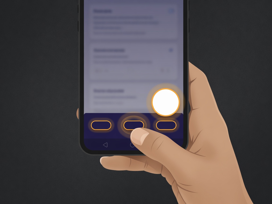
Most people operate their phones with one thumb. Primary actions should be easy to reach.
- Bottom navigation
- Floating action buttons
- Primary CTAs near the bottom
- Swipe gestures where they feel natural
Avoid burying important controls in the top corners where they are hard to hit one handed.
2. Make the first screen obvious
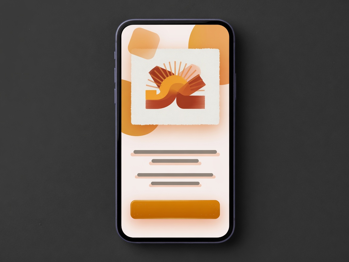
People should understand three things within five seconds:
- What is this?
- Why should I care?
- What do I do next?
If they have to think hard, you have already lost them.
3. Reduce choices
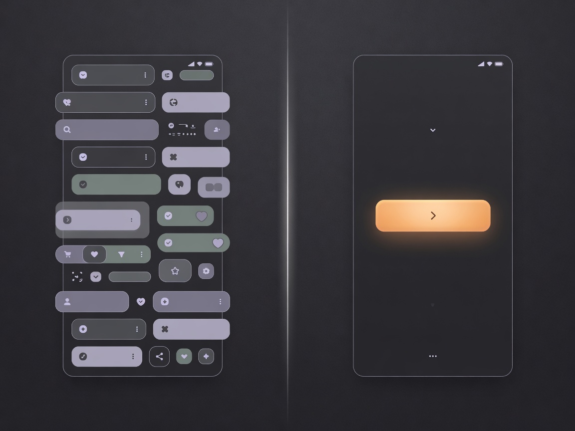
One of the biggest UX mistakes is giving users too many options at once. Explore, Discover, Browse, Community, Events, Meetups, Nearby, Search. That is not empowerment. That is decision fatigue.
Ask yourself: what is the one action people came here to perform? Everything else should support that goal, not compete with it.
4. Build around outcomes, not features
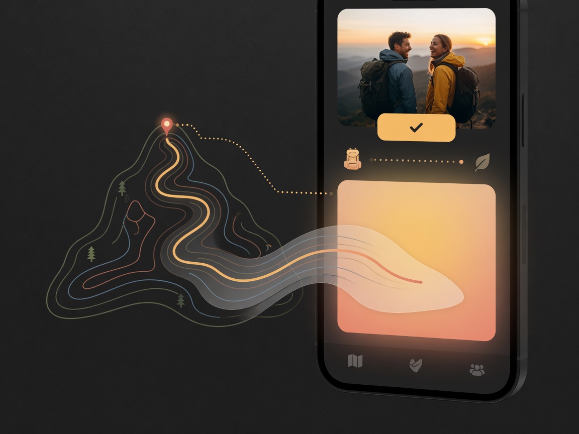
This is where many startups get it wrong.
Users do not want AI. They want better recommendations, faster planning, and less decision fatigue.
Users do not want social networking. They want someone to hike with this weekend.
Focus on the outcome the product delivers, and let features serve that outcome quietly.
5. Create a strong visual hierarchy
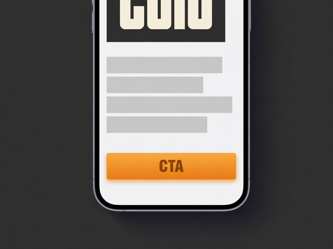
Large headline. Medium supporting text. One obvious CTA. Generous spacing. Consistent typography.
If everything competes for attention, nothing wins.
6. Performance is part of design
Beautiful interfaces do not matter if they take four seconds to load. Optimize image sizes, animations, network requests, and startup time.
Users perceive fast apps as higher quality, full stop.
7. Delight with micro interactions
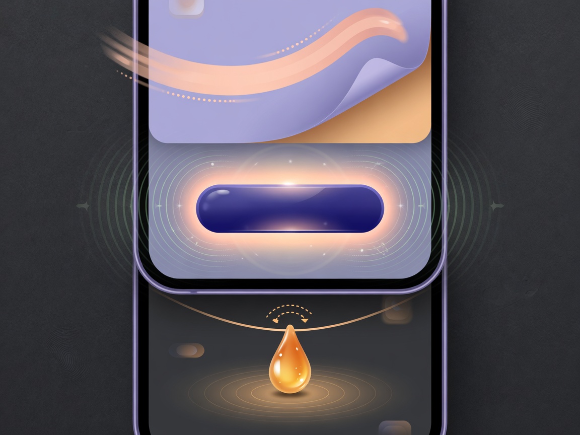
Small animations make products feel alive:
- Button press feedback
- Smooth page transitions
- Progress indicators
- Pull to refresh animations
- Haptic feedback
These details create a polished experience people remember.
8. Accessibility is not optional
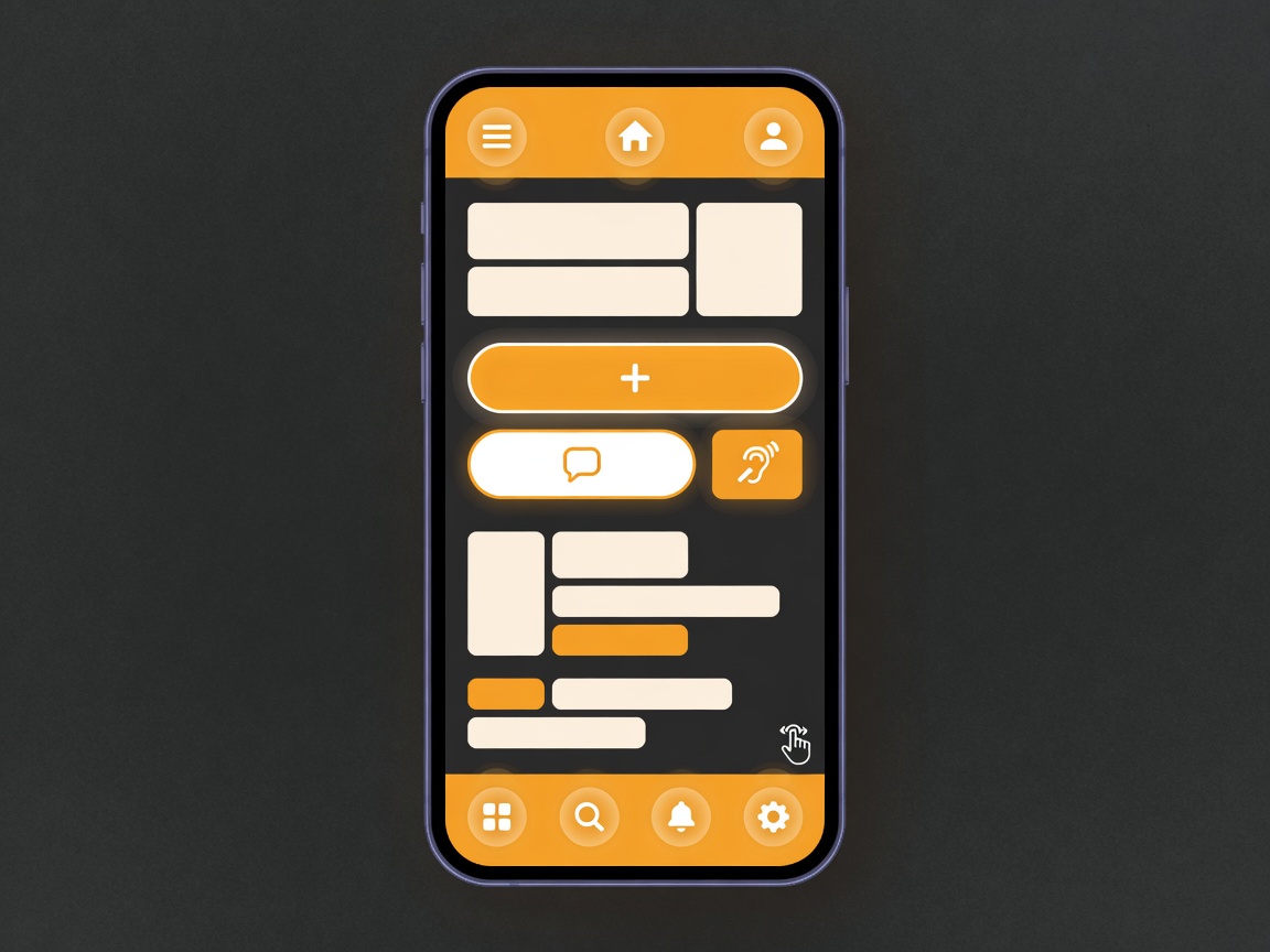
Accessible design benefits everyone. Follow practices such as:
- High color contrast
- Scalable typography
- Screen reader labels
- Large touch targets
- Clear navigation
Accessibility also broadens your audience and improves usability overall.
9. Build trust immediately
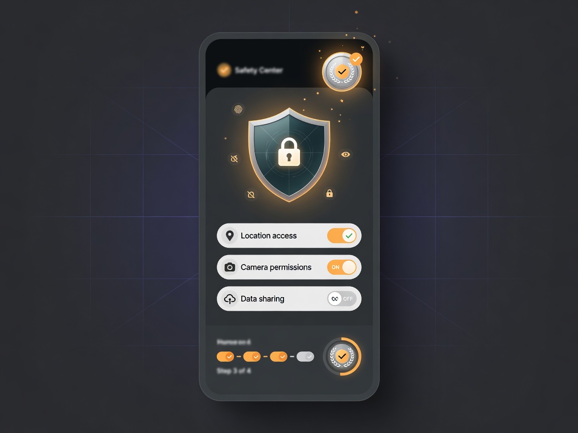
People share location, payment information, and personal data. Help them feel confident.
- Verified users
- Transparent privacy controls
- Clear permissions
- Visible safety features
- Honest onboarding
Trust directly impacts conversion and retention.
10. Use AI to remove work, not add it
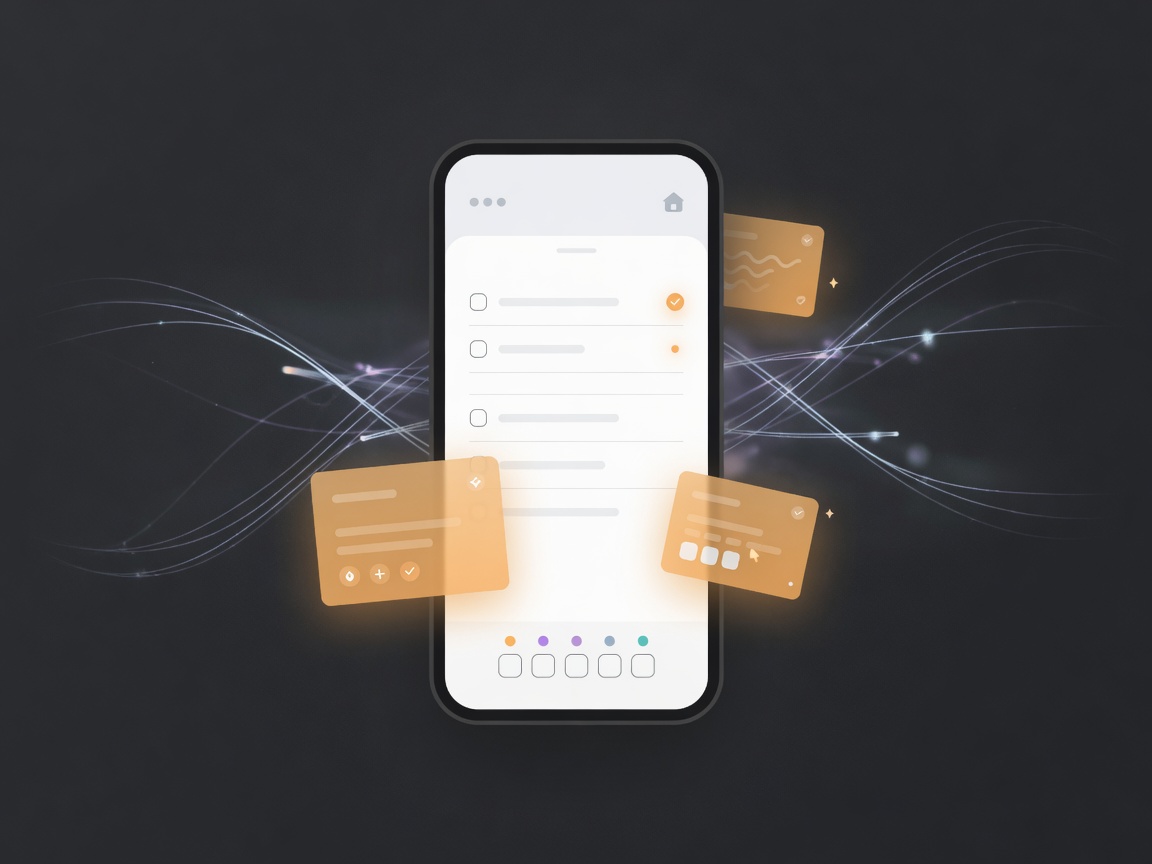
The best AI feels invisible. Users should not have to learn prompts.
Instead, AI should quietly reduce effort by suggesting plans, organizing information, recommending people, and predicting intent. The interface stays simple while the intelligence works behind the scenes.
11. Design for emotion

People rarely remember every screen. They remember how your product made them feel.
Did they feel confident, inspired, safe, excited, or accomplished? Great products create emotional moments on purpose.
12. Test with real users early

Perfection is impossible. Feedback is invaluable.
Even five real users can uncover navigation issues, confusing language, or unnecessary friction long before launch. Test early, fix the real blockers, and ship with confidence.
Case study: applying these principles to GüdTrek
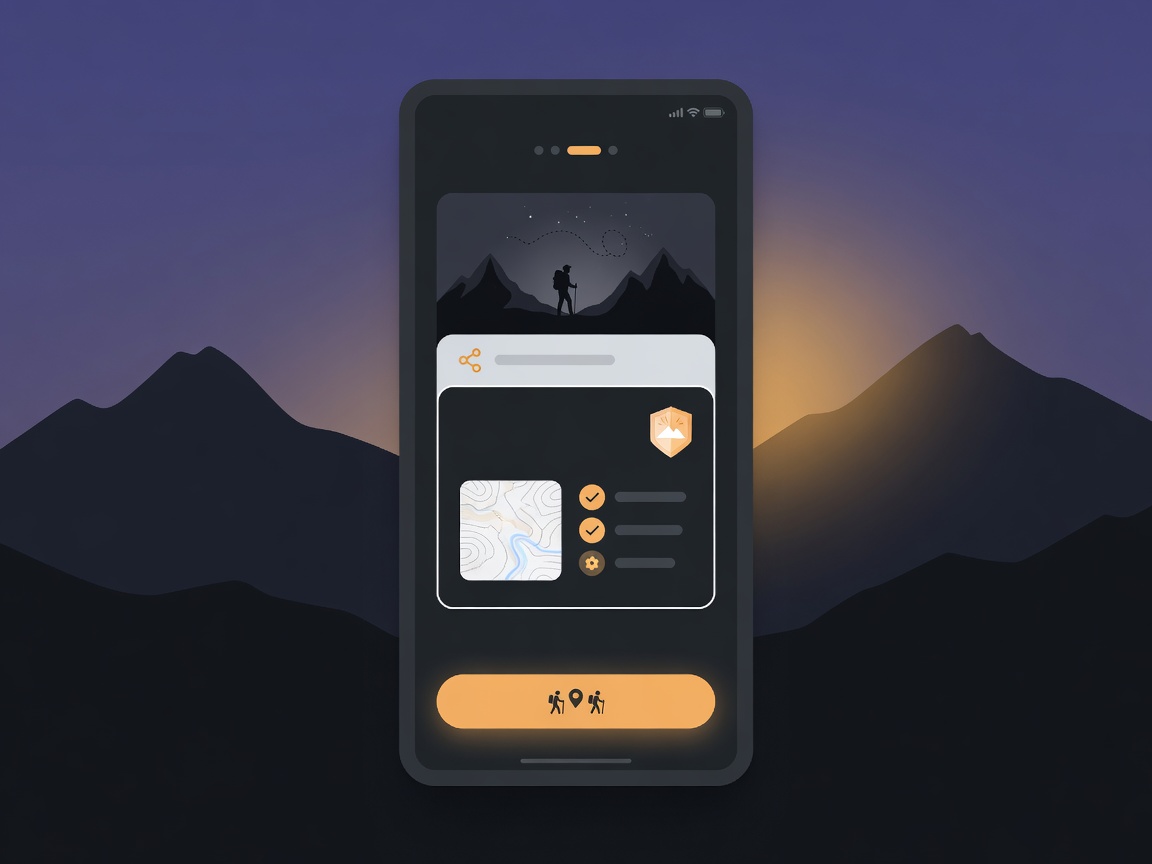
Instead of creating another social network for outdoor enthusiasts, GüdTrek focuses on a single outcome: helping people find the right adventure partner for the right adventure.
The interface emphasizes simple onboarding, AI assisted trip planning, safety features that build confidence without overwhelming users, a clean distraction free design, and one clear call to action.
That keeps the experience focused on getting outside, not learning another complicated app.
Final thoughts
The best mobile apps do not win because they have the most features. They win because they reduce friction, build trust, and help users accomplish meaningful goals with as little effort as possible.
When designing your next app, remember this simple formula: less thinking, more doing.
That philosophy is what turns an interesting idea into a product people return to again and again.
Building a product and want design that actually retains users?
Take the AI Assessment. We will help you see where automation and better UX can remove work for your customers and your team.
Take the AI Assessment →Keep reading: What Always On AI Agents Mean for Your Business →